


objective
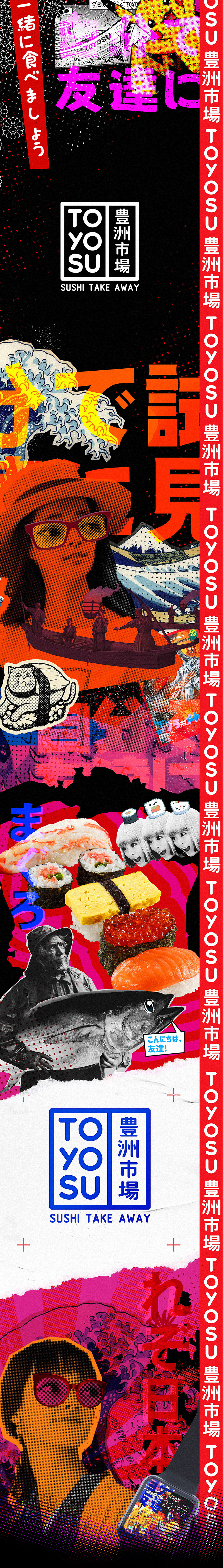
Change the existing reality in the world of Sushi, giving guests the opportunity to experience a new level of Japanese cuisine. The main idea of the project is an endless stream of visual information that has absorbed the cultural aspects of our life, ethnic and popular. The line between ethnicity and popular culture is blurring, turning into a juicy sweet soup of images – the face of the metropolis. "Toyosu" is a sushi market named after the wholesale market in Tokyo located in Toyosu area of Koto Special District. It consists of two seafood sites (one for wholesale, the other for auctions). The market was erected in the reclaimed areas of Tokyo Bay and replaced the famous Tsukiji fish market.


The logo is a combination of Japanese Inkan stamp and Tokyo nighttime advertising signs that cuts the sign into two blocks. Has two versions: classic square and horizontal orientation. Symbiosis of simplicity and manufacturability. Shintoism as the key philosophy of Japan says that nature has already given man all the best by creating our world. We just take her gifts and present them to our guests. By adding modern technologies, we were able to preserve the original taste and create the perfect sushi made by a robot sushi master. Moderately authentic but modern. Representative of the Japanese subculture; bright but discreet.


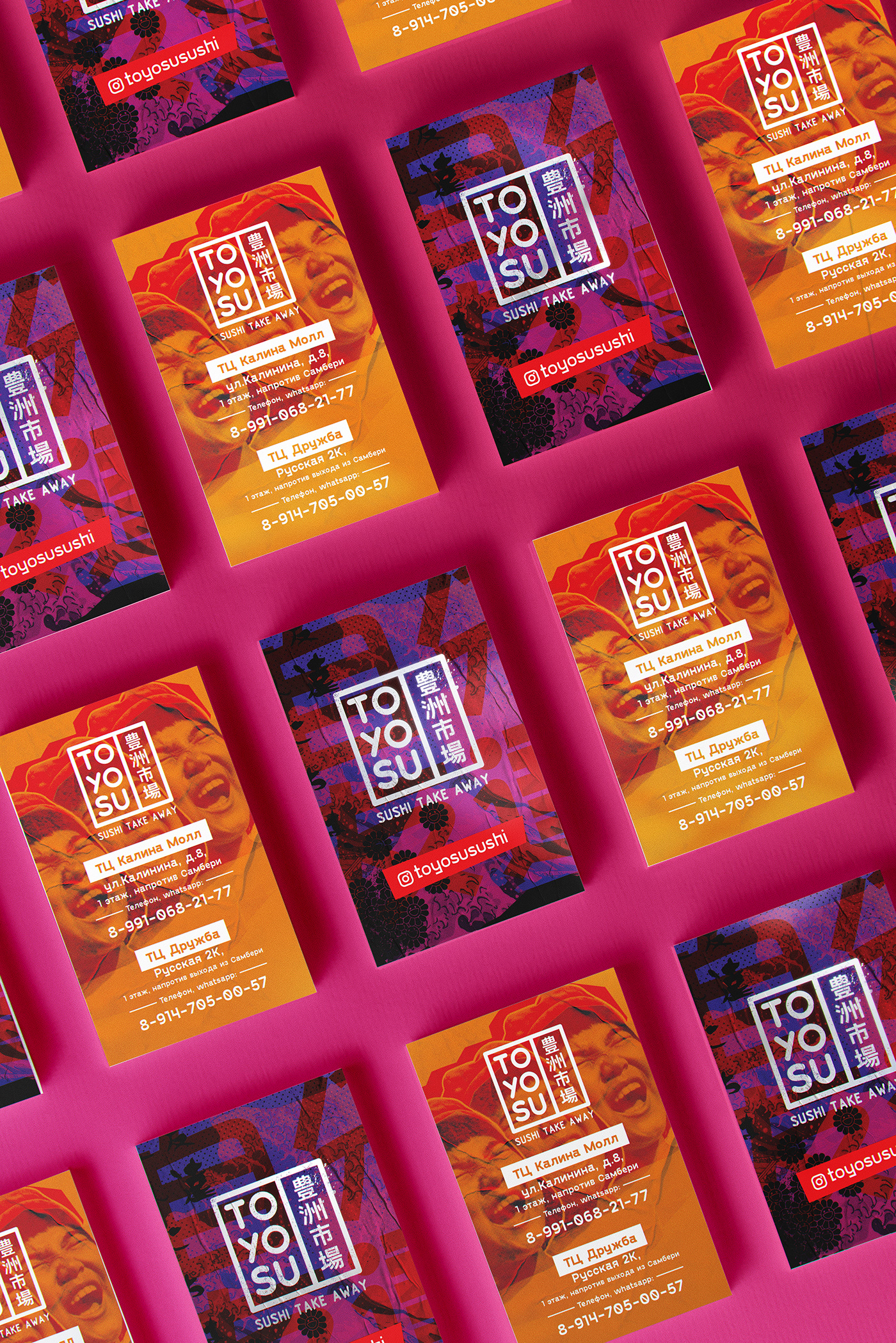


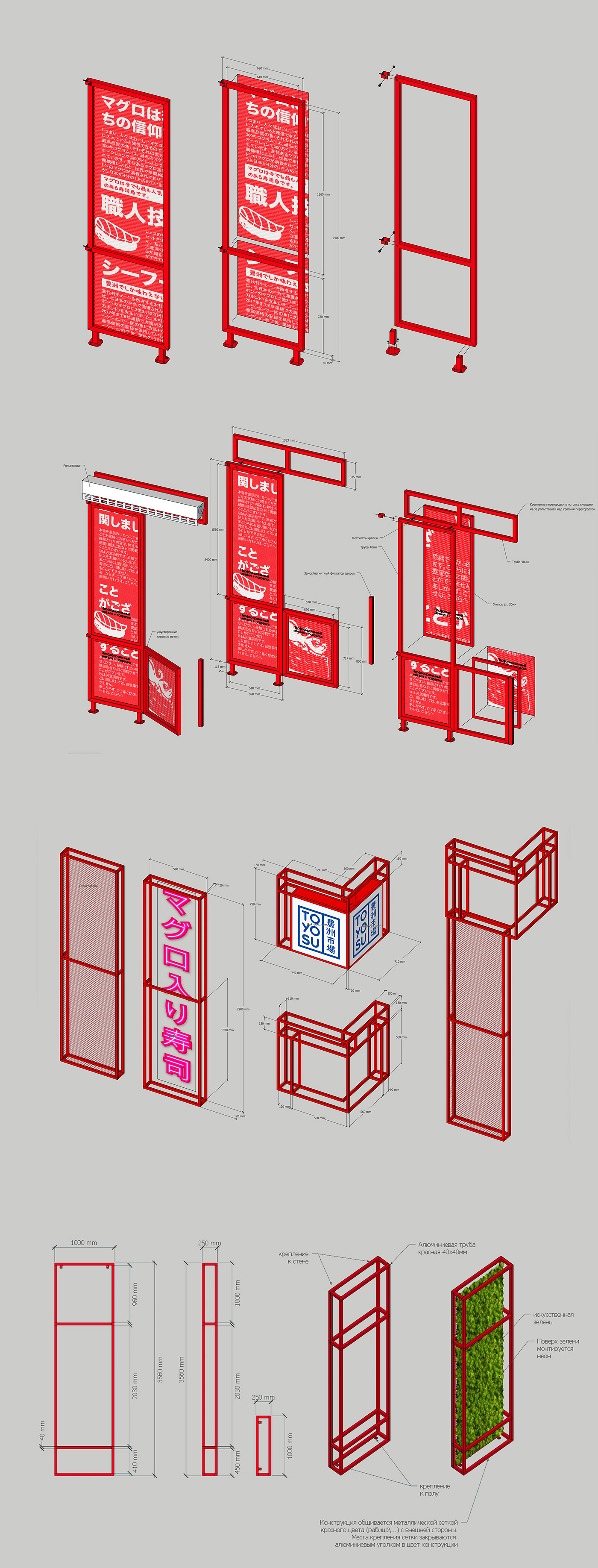
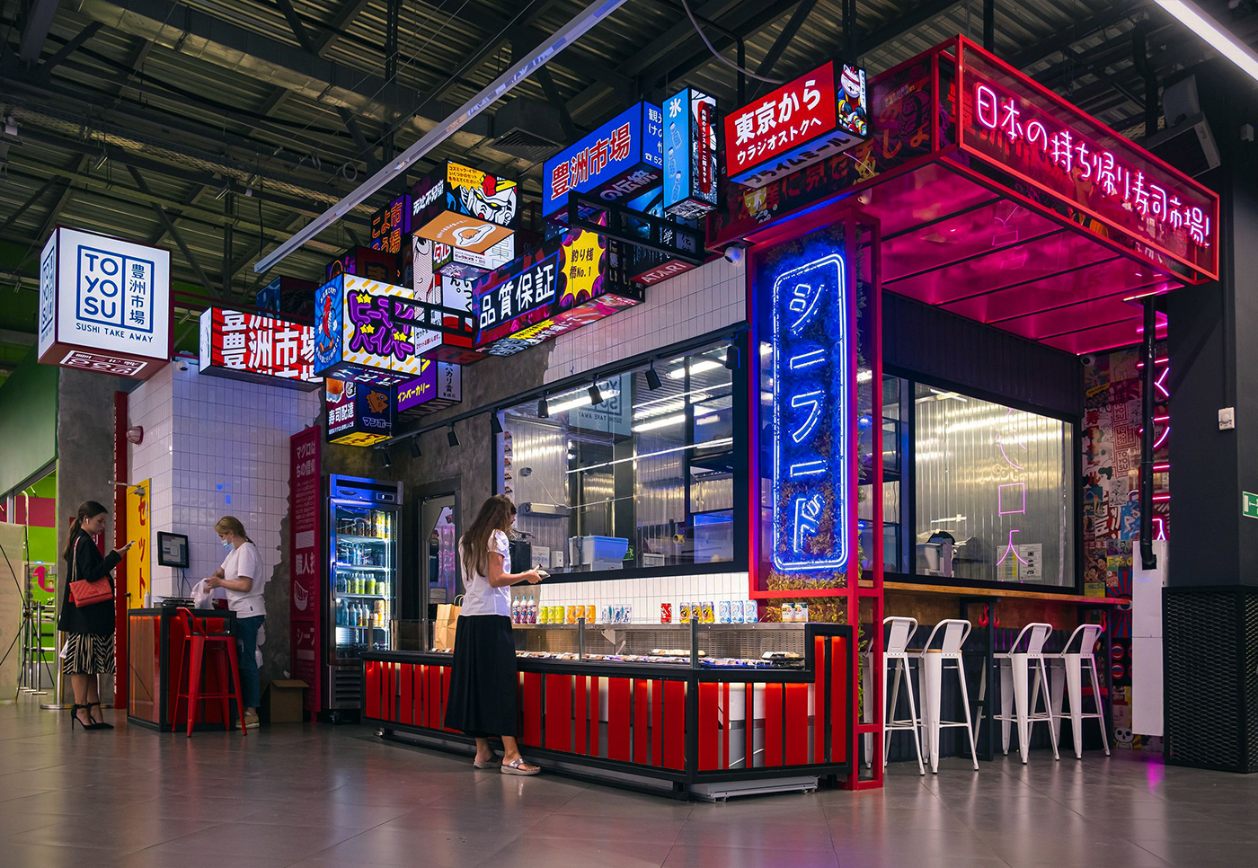
In addition to the branding work, there was a lot of work to be done on the design of the sushi markets themselves. It was inspired by the night streets of Kabuki-chō. Skyscrapers intertwine with small eateries and bars to create a show of light and texture, so much like the urbanism of Japan. Compliance with the concept completely excludes the presence of any Cyrillic inscriptions at the points of contact, possibly Latin, as a small exception.


Each project requires detailed elaboration of all layouts for production, from layouts for printing, to the exact placement of all light boxes and accompanying adjoining elements.


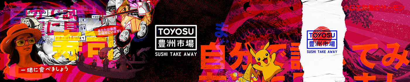
There are no rules. There are values embodied in an endless stream of visual images created over time. The project is a collective image that fits into a limited space.

Thank you.
どうもありがとうございます。


